Top Four Colors of the Year for Multifamily Interior Designers
Jan 23, 2019
Color us surprised – Pantone and other high-profile color influencers have released the trendiest shades of 2019 and it is an interior design firm’s technicolor dream! From a lively and luscious coral to an ancient, earthy hue of clay, HPA Design Group is excited to announce there is something for everyone in this year’s spread of the hottest hues. As a leading interior design for the multifamily industry, we understand color is essential to creating an unforgettable living experience for residents and guests. Plus, color is an incredible value add to any interior design project.
Whether you feel a space is best tinted in a radiant shade of yellow or a rich, ruddy brown, an eye-catching tone encapsulates your community’s culture and draws people in to experience its authenticity. Shouldn’t your interior be as vibrant as the people that live and work inside them?
So, if the new year has you feeling that your interiors could use a refreshing splash of personality, check out our preview of this year’s chicest shades below. We cover the go-to color industry leaders Pantone, Color Marketing Group, Sherwin Williams and Benjamin Moore.
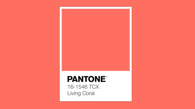
Pantone–Living Coral
Perhaps the most famous color influencer on the planet, Pantone predicts that 2019 is the year of coral—Living Coral to be precise. “Animating and life-affirming” is how the team at Pantone describes this deeply blushing hue that takes lively cues from its namesake ecosystem beneath the sea. In case that description does not persuade you to consider the color, the swooning verbiage doesn’t stop there with the official Living Coral page detailing its “humanizing and heartening” qualities for interiors.
Utilizing Living Coral in your space:
In the cold of winter, it is time to start planning for warmer months. Living Coral can be incorporated into your multifamily models and clubhouse with either small accents, large wallcovering murals or backsplash tile. This unique color brings joy and takes your mind to warmer locations; it is an instantaneous vacation.
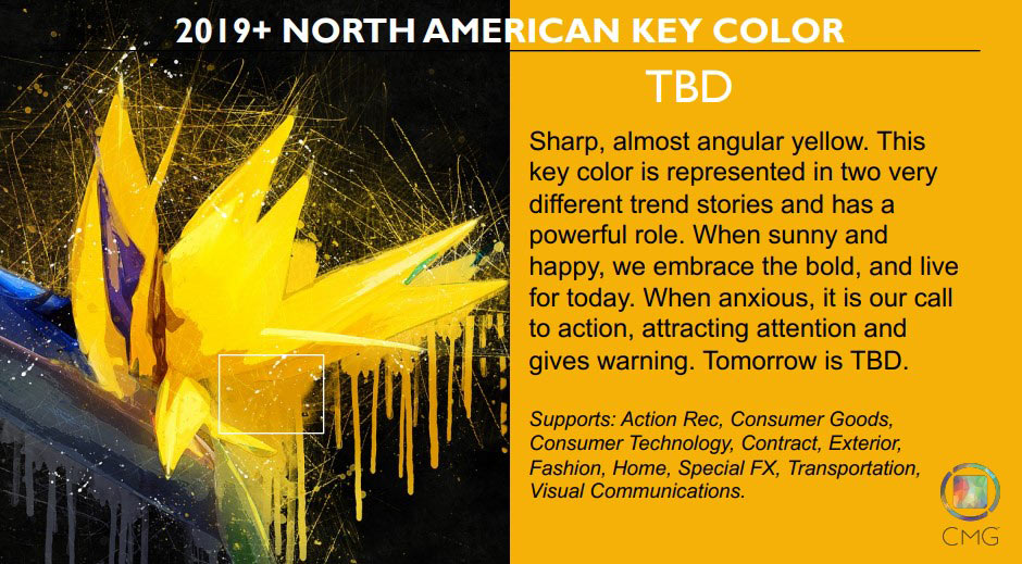
Color Marketing Group–TBD
You read that correctly, CMG’s North American Forecast is a golden yellow by the name of “TBD.” The leading international association of color design professionals praises the joyful tone as “unbridled, spontaneous fun,” and conversely as a “symbol of attention and warning.” A rich, yolky yellow is a staple in most interior designer’s pallet because of its powerful ability to bring warmth into any space. An article by Vogue predicting the next biggest colors also noted yellow as a “modern neutral” that was gaining widespread popularity.
Utilizing TBD in your space:
Trend seekers are already living comfortably with, and in, this zesty tone. It is eye-catching, forward-thinking and invokes a strong sense of carefully curated design aesthetic. Utilizing this color in your space in wall colors or branding is bold and will grasp anyone’s attention.
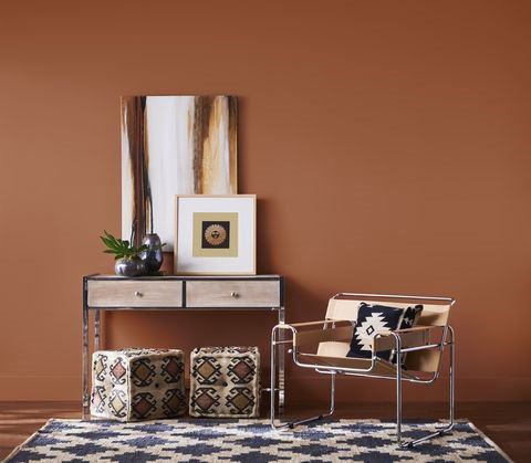
Sherwin-Williams–Cavern Clay
“Forged by sun. Fired by desert. Introducing Cavern Clay,” so reads Sherin-Williams’ homepage for its 2019 Color of the Year, an ancient brown with subtle contemporary undertones. Contrasting starkly with the previous entries in our list, Cavern Clay pairs well with interiors adorned in natural furnishings like exposed floors, leather upholstery and wood furniture. Sherwin-Williams goes on to suggest augementing this earthy shade with white, navy and taupe tones.
Utilizing Cavern Clay in your space:
This earth tone feels at home in multifamily amenities that evoke relaxation. Cavern Clay encourages a connection between the natural landscape and the built environment. This color is best enjoyed in comfortable seating areas, spas, and spaces adjoining the outdoors.
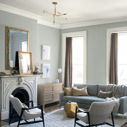
Benjamin Moore—Metropolitan AF-690
If ever there was a harmonious color to please almost any eye, it may be Benjamin Moore’s light and airy Metropolitan AF-690. Effortlessly chic, this pale grey elevates any multifamily interior by opening up a space and making it breathable and soothing. If gray days are inspiring your next interior design project, Elle Decor compiled an excellent list of calming and restorative grays that are sure to make your interiors. Side note: HPA Design has received many requests from luxury student housing clients to use pale greys for their interiors
Utilizing Metropolitan AF-690 in your space:
This delicate color appeals to a broad demographic of good taste enhancing any space with its calming tone. Using it as an overall paint or floor tile in multifamily common areas will provide a foundation for a universally pleasing palate.
For more HPA Design Group-related news and multifamily interior design insights, engage with us on Facebook, Twitter, LinkedIn and Instagram.